
Except where otherwise noted, content on this site is licensed under a Creative Commons Attribution-NonCommercial-ShareAlike 4.0 International license.
Privacy, Copyright, and Intellectual Property
In our discussions, we went down a rabbit hole about the “commodification of inspiration,” that “worthless” (no commercial value) human-written fan fiction is okay, but published/sold (high commercial value) LLM-created content from copyrighted training data is not okay. While theoretically, it could be possible to track this transference of value – if you can quantify a percentage of LLM influenced by published material as a share of its final market-determined value – in practice, setting up prescriptive laws is unlikely in the United States, where the priority tends to align toward the right of free expression over other concerns such as intellectual property. (Europe tends to side differently.) After-the-fact lawsuits, though still favoring the wealthy who can more easily afford to participate in such matters, let courts decide on a case-by-case basis the merits of transformative use, fair use, satire, parody, and so forth. My groupmates disagreed, but in my reading, “LET THE MACHINES PLAY.”
Bias and Toxicity In Large Language Models (LLMs) and Machine Learning
WK 3 – 9/18: Bias and Toxicity
- Slack #bias-toxicity: https://78000largelan-ive6005.slack.com/archives/C05NPRA04PN
- Group’s Google Doc: https://docs.google.com/document/d/1AkTf398mIQSr6insIbxzogT3TKifbU0MOgs50ZhNQtM/edit#heading=h.judzwu764h79
- McSweeney Notes: https://docs.google.com/document/d/1gks5aEmxaoOVqA28eEx6XaAUpS5CBoDXWmI5NQa9JzM/edit
The discussion on bias and toxicity (and setting safety rules by either human agency or secondary machine monitoring/constitutional AI) made me want to raise my p(doom) value based on three possibilities:
1.) Unintended human errors (programming mistakes in setting up rules).
2.) Intended human errors (bad actors ignoring ethics and agreed rules).
3.) Unintended machine errors (safety priorities are changed/removed by the machines).
The notion that “the safety system works most of the time but only has to fail once” made me recall an example from sci-fi: In 1968’s 2001: A Space Odyssey – one of the most famous “AI gone wrong” science fiction stories – the computer HAL-9000 of the spaceship Discovery One murders its entire human crew except for one resourceful surviving astronaut. Author Arthur C. Clarke reveals in his sequel novel 2010: Odyssey Two that HAL’s actions were the direct result of human error stemming from separate programming teams giving the AI conflicting operating rules on priorities: Inform the crew of all mission details but also prevent them from knowing the true secret goal of their mission. The only logical resolution? If there’s no crew alive to inform, there is no conflict in keeping the true mission secret.
Labs for DATA 78000: Large Language Models and Chat GPT
Mondays 6:30p, Room 5417, CUNY Graduate Center, New York, NY
Instructor: Michelle McSweeney, michelleamcsweeney.com
Course Site: https://github.com/michellejm/LLMs-fall-23
Link to this post: https://tinyurl.com/46ykcr68
Prompt Engineering Lab – Stanton for 78000
https://colab.research.google.com/drive/1qWsqeooxflEDoIw5kaTOu3iv7A2aC9zd
Ngrams Lab – Stanton
https://colab.research.google.com/drive/1HebbqSpe5WXT45j9Oh1y7vOfHk6RO_nw
Word Vectors Lab – Stanton
https://colab.research.google.com/drive/1B2Qy5AzfZEp_wF34yW4Z8S82lF6LtFbT
Tokeninzation Lab – Stanton for 78000
https://colab.research.google.com/drive/1YXfrKuSNtG1HuWTiQ_-Qh87ru276Bwuu
BERT Sentiment Via Huggingface – Stanton for 78000
https://colab.research.google.com/drive/1OXrTaE6Ot5CCdpjjIKnl5jE4Rp5CD9W5
Fine Tune LLaMa – Stanton for 78000
https://colab.research.google.com/drive/1aAPu6seGLfQAymM-j5-87JFiW2jR8HK-
PROJECT III: WHITE PAPER
DOWNLOAD PDF VERSION: http://chimaboo.com/coursework/DATA73000/STANTON-WHITEPAPERDATA73000.pdf
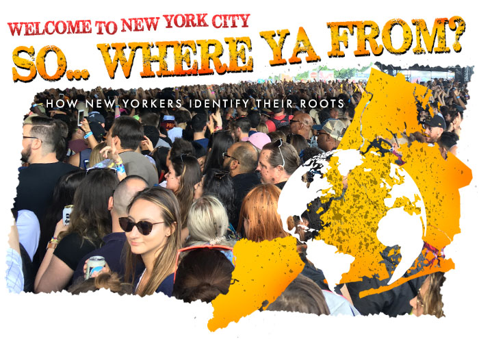
“FROM ATOP TABLEAU, I CAN ALMOST SEE WHERE Y’ALL FROM”
FINAL PROJECT WHITE PAPER FOR DATA 73000: INTRODUCTION TO DATA VISUALIZATION
WRITER: Matthew Stanton ([email protected]), May 2023
SUMMARY
“So… Where Ya From? How New Yorkers Identify Their Roots” was inspired by previous work on measuring the educational cost of NYC’s “stop-and-frisk” era and the population changes in New York City due to Robert Moses’ transit infrastructure overhaul. It also drew inspiration from the author’s own neighborhood in Brooklyn, which is home to a diverse range of residents from various ethnic backgrounds.
The dataset used in the project was obtained from IPUMS USA, which provides U.S. census microdata. The dataset included a 1% sample from the 2021 U.S. Census for each of New York City’s five boroughs. However, due to limitations in the data, the project had to pivot from mapping ethnic demographics to focusing on how New Yorkers identify their roots when asked about their ancestry. Challenges faced during data cleaning and categorization, grouping and merging variables to create meaningful categories for analysis, allowed for a version of a Sankey diagram and other visualizations to represent the data.
Future iterations of the project should include a larger sample size and address the issues of undercounts and classification challenges. Additional insights were gained during the May 2023 poster session, including the discovery of potential misrepresentations of certain ethnic groups and the idea of using age as a projection of future growth by ethnic segments.
INTRODUCTION
The visualization “So… Where Ya From? How New Yorkers Identify Their Roots” (https://tabsoft.co/3q0xDHJ) was formed around the final project scope to formulate a research question, find a dataset to address that question and create at least three visualizations that provide insight into the question – ideally using Tableau software and techniques learned through various labs and readings offered in the Spring 2023 “Introduction to Data Visualization” course.
The inspiration for the topic grew from some initial project in the previous semester, “Measuring the Educational Cost of NYC’s Stop-And-Frisk Era (2005-2019)” (https://bit.ly/41PLdL7). The New York Police Department’s program of aggressively targeting specific communities and making temporary warrantless detentions had only recently dropped off from its annual high of 685,724 documented stops in 2011. Eventually curbed by U.S. District Court Judge Shira Scheindlin’s ruling in Floyd v. City of New York, the program was found unconstitutional and showed “significant evidence that the NYPD acted with deliberate indifference,” especially toward Hispanics (four times as likely as whites to be stopped) and Black New Yorkers (10 times more likely to be stopped).
Directly influential was Quinn Hood’s stop-and-frisk visualization (https://qhood01.github.io/nycSQF/), a fantastically utilitarian illustration of where, when, and on who the policy directly affected. At the time a research associate with Vera’s Greater Justice New York initiative, Hood worked primarily on quantitative analyses of the impact of New York’s recent bail reform legislation, and previously at the Data Collaborative for Justice at John Jay College where he helped produce reports focused on low-level enforcement in New York City.
Also of interest was the rapid population change in New York City following Robert Moses’ overhaul of the region’s transit infrastructure to prioritize automobile traffic to suburban satellite communities, the 1950s-1960s “white flight” that development enabled, and the resulting loss of municipal tax base by the and caused the financial crisis of 1975 (see Kim Phillips-Fein’s Fear City: New York’s Fiscal Crisis and the Rise of Austerity Politics, https://bit.ly/45iMehO).
Lastly, I was inspired by my current home neighborhood of Kensington in central Brooklyn, a mixture of Polish, Bangladeshi, Pakistani, Indian, Latin American, African-American, Orthodox Jewish (Hasidic), and Central Asian residents. According to data on one real estate website (https://bit.ly/3IskihE), one in four Kensington residents was born outside the United States. Here conversations in Yiddish and Spanish mix on sidewalks under loudspeakers broadcasting Islamic calls to prayer, and in each school day, a diverse range of parents walk their children to the same schools.
Almost immediately, the challenge of definitively mapping ethnic demographics to New York neighborhoods ran into problems of identity and granularity, as explained below. Limited by only how people declare themselves, and only tracking to the county (borough) level, the project question had to pivot from “Where do New Yorkers of various ethnic groups live?” to “How do New Yorkers identify their roots when asked about their ancestry?”
BACKGROUND
The starting place for the dataset came from IPUMS USA (https://usa.ipums.org/usa/), a freely available source tied to the Minnesota Population Center and University of Minnesota that “collects, preserves and harmonizes U.S. census microdata and provides easy access to this data with enhanced documentation.”
A .csv file was exported to include a 1% sample from the 2021 U.S. Census, from each of New York City’s five boroughs – Bronx County (ICPSR 0050), Kings County (Brooklyn) (ICPSR 0470), New York (Manhattan) (ICPSR 0610), Queens County (ICPSR 0810), Richmond County (Staten Island) (ICPSR 0850). Getting down to postal ZIP codes, community boards, or police precincts would have been preferred, but the available IPUMS data did not group that far down.
Using the most recently available data also came with a unique problem: NYC residents fled the city in 2020 amid the COVID-19 pandemic (https://www.unfpa.org/resources/technical-brief-implications-covid-19-census), and that cycle’s U.S. Census operations saw unprecedented procedural interference from Trump administration officials (see email from Office of the Director Chief of Staff Christa D. Jones, https://bit.ly/43bDecv).
Also, from a total population of roughly 8.4 million New Yorkers, a better 5% dataset should have contained 420,000 records – but in fact, the IPUMS data fell far short with only a 1% sample of 186,000 records. The working sample shrunk even more when accounting for the 42,000 records in which no response was given about ancestry. Such null responses were removed. A quick glance at the data showed some glaring omissions: No records cited ancestry of origin to Columbia, despite there being Columbian students currently enrolled in the CUNY Graduate Center Data Analysis and Visualization program.
Next, the closest option for tracking ethnicity was “ANCESTR1 – Ancestry, first response” within the Race, Ethnicity, and Nativity variables list. While the responses grouped by region were fairly specific (001 Alsatian, Alsace-Lorraine, 002 Andorran, 003 Austrian, 004 Tirolean, and so forth), they proved inconsistent overall. Some responses about individuals’ points of ancestry were vague or broad (“European” or “Slavic”), while others were based on racial self-identifications (“African-American” and “Afro-American,” separate from responses as “American,” “North American,” or even various lineages back to African countries). And what about Black Hispanics who were only recorded in one category? Or people of mixed heritage, be it by race or country?
Finally, the planned visualizations intended to represent a “coming to America” flow through the use of a Sankey diagrams, especially since such models were temporarily available in a pilot test from Tableau Public (https://tabsoft.co/3OugfW6). Unfortunately, early mockups showed the Sankey visualizations including Continent-Region-Country-Borough as flow marks would become too noisy to track, resulting in a riot of tiny lines instead of smoothly funneled paths. Groupings would instead need to be moved as footnotes shown in path tooltips.
PROPOSED SOLUTION
Initial data cleaning into bins was done in Python via a Google Collaboratory notebook (https://bit.ly/41ZkYlA), and saved back into a new Excel file. Variables for tracking Continent, Region, Country, and description of nationality were added. Some adjustments around “Continent” were made, treating Russia as its own unit outside “Europe” or “Asia,” and granting “West Indies” its own status as a “continent” outside North or Central America in order to highlight the statistical significance of Puerto Ricans, Dominicans, and Haitians in New York City’s population.
Further “bin cleaning” (in this case, treating base categories as bins) was done manually, deciding which variables could be merged. Some decisions were straightforward (“African-American” and “Afro-American” becoming one count), others arguably done for simplicity (“Mexican,” “Mexican American,” “Nuevo Mexicano,” and “Chicano/Chicana” all becoming one “from Mexico” tally), and some arbitrary (in which “British” and “English” were merged, but “Scottish” and “Welsh” were left as separate identities).
For the sake of completeness, ethnic-based “Lineage” was included on par with “Continents,” but the distinction raised an important issue: The responses were not objectively founded, as might be said about DNA testing results from such services such as Ancestry.com or 23andme.com. Instead, responses reflected how those surveyed expressed their desire to be seen as themselves. The given records in the data assumed the person’s chosen priority self-identity, though membership of one group might imply inclusion in other hierarchies of race, region, or continent. (Interestingly, though many respondents cited their familial country of origin as “USA,” only one U.S. state saw people report claims of direct origin: Texas.)
Both of the core problems – small data sample size and “race versus place” classifications – would need to be informed to the user before sharing any graphic visualizations – a grossly inelegant solution. A better (and future) presentation of these visualizations should be based on a much larger sample to reach the 5% minimum or, ideally, even larger. An alternative would have been to find exports of different sample cases and repeat the binning process, though issues of duplication would need to have been filtered out.
Once the initial Sankey diagram was created, adding additional views of the same data – bar charts, pie charts, treemaps, bubbles, and global mapping – were tested for inclusion in the final narrative package. Photo illustrations and light-hearted descriptions of boroughs were intended as visual cues to help distinguish what otherwise could have been visually too similar charts from Tableau.
The global map visualization presented its own problems. Records based on classifications that did not track to geographically defined countries – all Lineages such as “Hispanic” or “Asian,” broad regional designations such as “Northern European,” and stateless labels such as “Palestinian” or “Assyrian” – were dropped from the mapped counts.
Also, the United Kingdom created a significant misrepresentation. The combined points of origin should have shown 12,358 records, but since the dataset tracked “England,” “Scotland,” and “Wales” separately, no data was paired with the map’s parameters for the U.K. The solution seems simple: Manually add “United Kingdom” as records from the sum of England+Scotland+Wales tallies, and then either include or exclude on each visualization (see https://tabsoft.co/3MJp2BY for such a model). However, the Tableau Public Sankey diagram could not be made to exclude the redundant U.K. data, meaning the already significant England counts would be double represented. The lesser evil was to exclude the U.K. count from the map and add an annotation (another awful compromise). Hopefully, future implementations of the Sankey diagram model in Tableau will include full functionality to better tailor what data can be shown or excluded as needed.
CONCLUSION
The final visualization evolved from the pin-up session to remove less compelling visualizations, revise other explainer data, and add in the missing city-wide treemap illustration.
Two critical additions arose during the poster session on May 15, 2023.
First, something that confused me in the dataset was the high proportion of Germans noted in the points of origin. I had heard a great many Germans died in the PS General Slocum steamboat disaster in the East River back in 1904 (https://bit.ly/3Os2vLi). Still, my popular notions about European ancestry in New York were dominated more by the Italians, the Irish, and even the original founding English and Dutch.
And where were the Jews? According to the decade-old Jewish Community Study of New York by the UJA-Federation of New York (https://bit.ly/3OB82PE), more than 1 million Jews should have been included in the U.S. Census – the largest such demographic community in the United States. For New Yorkers, one would expect responses not just identifying people as Jewish, but in lineages of Ashkenazi Jews, Sephardic Jews, and the Hasidic subculture.
IPUMS USA data tends to be unhelpful regarding religious data. Observers at the poster session helped point out the structure of the question about ancestry, “What is your country of origin,” may have masked these hundreds of thousands of Jews in tallies for Germans, Russians, Romanians, Austrians, Hungarians, and other Central and Eastern European countries. (For more on the topic, see After They Closed the Gates: Jewish Illegal Immigration to the United States, 1921-1965 by Libby Garland, https://bit.ly/3Otk5yI).
Second, an additional facet of the data was to include age as a projection of future growth by ethnic segments. By noting which ethnic groups had a younger median age, one could project those groups promised to have a higher growth rate if other factors remained equal. During the poster session, I found Nuraly Soltonbekov’s “The Case for More Immigration” (https://tabsoft.co/45g28JL) seized on that very idea but on a nationwide level for the whole United States. His method of visualizing deaths and births, and supplementing gaps in population growth through immigration, can easily be filtered to apply to just New York City’s five boroughs – a new project to work on over the summer.
PROJECT III: Welcome to New York City… So, Where Ya From? (Pin-up Draft)
New York is the “crossroads of the world,” but among today’s residents, where did everyone come from? Or rather, how do they identify their roots when asked about their “ancestry,” either as newly arrived immigrants, first gen natives, or Gotham’s Old Guard of past generations? And, whether from far-off lands or just over the bridge-and-tunnel borders, where did they settle down amid the city’s constant change?
Looking at the most recent data to answer these questions poses two challenges. First, when using U.S. Census data from IPUMS USA, the most recent collection available – a sample excerpt from the 5-county population of NYC, about 144,000 records – was taken as NYC residents fled the city amid the COVID-19 pandemic, coupled with unprecedented procedural interference from Trump administration officials.
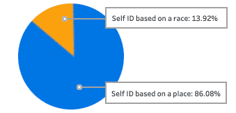 Second, there is the “Race Versus Place” issue. The census data about ancestry was voluntary, with only a portion of those surveyed responding with answers. Even worse from a data collection standpoint, some responses about point of ancestry were vague (“Asian” or “Slavic”), while others were based on racial self-identifications (“African-American” and “Afro-American,” separate from responses as “American,” “North American,” or even various lineages back to African countries). And what about Black Hispanics who were only recorded in one category? Or people of mixed heritage? For the sake of completeness, ethnic-based “Lineage” is included on par with “Continents” in the graphs below. The responses are not scientific; they reflect how those surveyed expressed their desire to be seen as themselves…
^ View the above graphic on Tableau Public
^ View and expand the above graphic on Tableau Public | NOTE: The United Kingdom does not appear counted on the above map since England, Scotland, and Wales were tracked as separate ancestral identities in the source data. For U.K. metrics, see the Western Europe tallies below.
^ View and expand the above graphic on Tableau Public
Diversity By Borough
Finally, the following treemaps show the relative populations claimed by local New Yorkers in the IPUMS USA 2021 sample of 143,859 records.


^ View and expand the above graphic on Tableau Public

^ View and expand the above graphic on Tableau Public

^ View and expand the above graphic on Tableau Public

^ View and expand the above graphic on Tableau Public

^ View and expand the above graphic on Tableau Public
Who Cares Where Ya From? Does It Matter?
The impact of peoples’ heritage on New York City can be a blessing and a curse. Of the original IMPUS USA data pull, nearly 30% – or 42,098 – lacked any reported ancestry information. Ethnic identities, and especially racial ones, are social constructs with histories of fluid definition at best. Some may see “Where ya from?” in the same offensive light as asking BIPOC people, “What are you?”
But yeah, it matters.
On the bright side, New York City’s cultural diversity brings together a vast array of foods, fashions, and ideas. The iconic food truck industry alone and glutton magnets like Smorgasburg should be reason enough to celebrate the broad palate found across the five boroughs.
On the dark side, cultural and racial identities have an obvious history as excuses for inequalities, disparities, intolerance, and violence. For example, at the height of the New York Police Department’s “stop-and-frisk” policy for cases logged by police in 2011, a Hispanic man was four times as likely to be subjected to a stop as a white man, while a Black man was 10 times more likely to be stopped. According to quarterly analysis of NYPD records by the New York Civil Liberties Union, of the more than 685,700 “stop-and-frisk” encounters logged by police that year, 12% led to some form of criminal charges (possession of marijuana, prior outstanding warrants, or possession of a weapon). The remaining 88% of those stopped were completely innocent of any wrongdoing, but records of such stops could be used as “predictive guilt” in future legal matters.
But on the bright side… did I mention Smorgasburg?
PROJECT II: Just How Much Dungeons & Dragons Have I Run In 40 Years?
For more than four decades, I have organized games of Dungeons & Dragons, the famous fantasy role-playing game invented in 1974 near my southeastern Wisconsin birthplace. I began as a 12-year-old “Dungeon Master” for my neighborhood friends, and just two years later, I was writing and running adventures at Gen Con, the biggest D&D convention in North America.
More than a thousand hours would follow, joining with hundreds of players to create shared stories – many detailed on EpicSavingThrow.com.
Like most role-playing games, Dungeons & Dragons pairs the idea of the quantified self with each player’s personal fantasy of gaining superpowers. If you could be someone else – anything you can imagine – what would you choose? Would you pick great physical prowess or knowledge to command magic? Would you be human, a creature from myth, or something far more strange? In D&D, every one of those decisions is quantified data: ability scores like Strength and Intelligence, power levels measured in character classes, and more.

Once you have an “imaginary quantified self” written out on a character sheet, you can start playing the game with other players: The characters meet, their shared story begins, and everyone takes turns making decisions and rolling dice to overcome obstacles described by the Dungeon Master (DM).
While I’ve enjoyed D&D on and off since junior high school, there was one question I had not reflected upon: Just how many games have I helped organize, schedule, and manage? How many players had I helped experience this fantasy adventure game? How many hours had I spent behind a Dungeon Master’s screen?
It turns out my DM history of helping people experience D&D looks something the visualization below: at least 266 organized events remembered, each with 4 to 31 players at a time, and averaging about three and a half hours of play every session. By rough estimate, that’s more than 925 hours involving more than a thousand different players.
Click to view on Tableau Public
Source: Convention programs (Gen Con, Chaoticon, Gary Con, PAX Unplugged), event listings on the NYC Dungeons & Dragons Meetup Group, and personal campaign notes on EpicSavingThrow.com.
Let’s break down that cluttered timeline a bit…
There And Back Again: The Wisconsin Era
The mid-1980s suburban Midwest was very much like what was recreated in Stranger Things, minus the constant psychic horrors.
I got my first Dungeons & Dragons boxed set as a birthday gift, soon followed by the hardcover Advanced Dungeons & Dragons rulebooks. While an anti-D&D girlfriend delayed further games for awhile, D&D proved great at making new friends in the basement of my college dorm. Throughout the 1990s, chasing new career opportunities allowed for only infrequent game conventions, but such events where thousands of players would gather allowed for much bigger games in experimental rules formats – especially tapping into the “live action” role-playing craze of the time.
Click to view on Tableau Public
Journey To The East: The New York City Era
Upon moving to New York City in 2005, I had to find new friends. Answering an online ad, I met a group who happened to work at Google’s brand new headquarters in Chelsea, and soon our secret weekend Dungeons & Dragons was a regular happening (though eventually discovered by Larry Page while he was walking past our game in progress). A few more pick-up games from ads followed, running adventures in others’ homes in Midtown and the Upper West Side.
Realizing there were many isolated former players and curious newcomers out there, I began helping run games and playtest a new rules update at The Brooklyn Strategist in Carroll Gardens and The Compleat Strategist in Midtown Manhattan.
In 2014, to help popularize the new 5th D&D edition, I created FastCharacter.com to get players into the game as quickly as possible. Soon I was organizing games at gaming stores, cafes, and bars across Manhattan and Brooklyn right up until the chilling isolation of the pandemic sent players exclusively online for a time.
Click to view on Tableau Public
Finally, a Peek at D&D ‘Quantified’ Character Sheets
Across these past four decades, I have given life (and suffered death) to many fantastic characters. A few such “imaginary quantified selves” still linger in my memory, especially a few favorite “bad guys” thrown at players to challenge them…
PROJECT II: Initial Draft Concept
For more than four decades, I have played and organized games of Dungeons & Dragons, the famous fantasy role-playing game invented in 1974 near my southeastern Wisconsin birthplace. I began as a 12-year-old “Dungeon Master” for my neighborhood friends, and just two years later, I was writing and running adventures at Gen Con, the biggest D&D convention in North America. Since it was originally published, there have been more than 13 editions of various basic and advanced rules, but for the most part the way players decide what their characters can and cannot do in their shared storytelling has remained fundamentally similar.
During the game, one player in the role of Dungeon Master (DM) describes a scene. Other players take turns describing their characters’ responses. When the outcome of any decision needs to be measured for success or failure, dice are rolled and specific numbers from each character’s dataset are added. The higher the total, the better the result.
Like most role-playing games, Dungeons & Dragons is closely tied to the idea of the quantified self. Every character in the shared world of fantasy is literally a statistical proxy for a real world player. Some creative players prioritize dramatic backstories for their characters’ pasts, while more tactical players focus on getting the ideal combinations of factors needed to be most effective in a specific task.
Are you the realm’s deadliest archer? A most cunning burglar? Craftiest spellcaster? Even before the first dice are rolled, these decisions reflect how a player wants to play the game and who they want to pretend to be.
In the current most popular version of D&D, now simply called 5th edition, character data is mainly based on two sets of base numbers:
- Ability Scores: A rating from 1 (low) to 20 (high) measuring Strength, Dexterity, Constitution, Intelligence, Wisdom, and Charisma. In earlier versions of D&D, a character’s racial heritage could impact these ability numbers – dwarves were tougher, elves were quicker and smarter – but such essentialist stereotypes have fallen out of fashion in recent years.
- Class Levels: A rating from 1 (novice) to 20 (epic hero) measuring skills related to specific character classes, familiar genre archetypes such as sword-swinging warriors, magic-shaping wizards, sneaky rogues, and so forth.
There are many more modifiers and numbers used throughout the game, but almost all of them are derived from the combination of ability scores and character levels.
GETTING TO PLAY FASTER
After moving to New York City in the mid-2000s, I began to organize open games of D&D at venues across Manhattan and Brooklyn: game stores, bars, cafes, and more. People could drop by, play the famed fantasy role-playing game for a few hours, and get a chance to meet new people. However, with the 5th edition “core game” rules totalling more than 980 pages, getting started could be daunting to newcomers and experienced players alike.
To help facilitate set-up for such events, in 2015 I created FastCharacter.com, a website allowing game organizers and players to quickly create dozens or even hundreds of pre-generated character sheets used during the course of each game session. Since then more than 2.3 million people have generated 9 million character sheets from the website, growing increasingly diverse as more D&D rulebooks were published.
I know what kinds of characters I like to create (see below), but capturing this user data could answer an interesting question: What are the most popular types of characters being created from FastCharacter.com?
Using a dataset of the top 50,000 most generated combinations of character race, class, and level, the following visualizations illustrate some of the most popular choices. Selection options below a specific frequency – typically less than 5,000 – have been excluded as outliers. Also, the website has been designed to limit players to choosing one option per category, even through the official rules allow characters to earn levels in more than class at once.
Who Uses The Website?
Based on samples drawn from all FastCharacter.com data, the majority of site users fall in the 18-24 age range, and roughly 1 in 5 identifies as female via Google Analytics.
What Are The Most Popular Classes?
More than any other factor, a character’s class determines what decisions a player is going to be making during a game. Class sets the complexity and diversity of powers and features available to a character, including what spells may be cast, what weapons and armors may be used, and how much damage can be suffered before death.
So what does character class choice tell us about D&D players?
THE ARCANE (Artificers, Sorcerers, Warlocks, Wizards): These characters rely heavily on either Intelligence or Charisma to command the widest range of the most powerful spells. The rules for these classes range from medium to high complexity, often requiring players to carefully note different ranges, areas of effect, durations, and uses per day for various magical powers. Only the artificer, a crafter of magical machines, relies on armor and weapons directly. Such characters tend to be easier to hit and take less damage before falling in combat, meaning players will need to pair up with other player’s more protective characters to keep them out of harm’s way. Play an arcane character if you enjoy flashy moments of big impact.
THE DIVINE (Clerics and Druids): These characters rely on Wisdom to use magic, turn away undead, and transform into beasts. Their spellcasting options make them medium to highly complex to play, and certain types of divine classes excel at healing other players’ characters to keep them going on adventures. Play a divine character if you want a variety of options but plan to spend time supporting your teammates.
THE EXPERTS (Bards, Rangers, Rogues): These characters rely on Dexterity and one other ability, typically Wisdom or Charisma. They each have core unique abilities – inspiration for bards, focused attacks for rangers, sneak attacks for rogues – but more than other classes, they also tend to offer their own styles of versatility. The range from low to medium complexity, good for players who want to stand out as leaders and specialists.
THE WARRIORS (Barbarians, Fighters, Monk, Paladins): These characters rely on either Strength or Dexterity to deal out continuous attacks over and over again. Generally considered low to medium complexity roles, players who choose these classes are happy to declare “I hit it with my weapon” every time their turn comes around during combat. They often serve as protectors to weaker characters in the group, such as those from the arcane classes.
What Are The Most Popular Levels?
Most characters created on FastCharacter.com are 3rd to 5th level – a popular starting point for new games. Higher level characters may be created for games that have been running for a long time, or to create powerful “non-player characters” Dungeon Masters may use as allies or adversaries.
What Are The Most Popular Races?
In the very first version of Dungeons & Dragons, players could only choose from humans, dwarves, elves, and halflings (little folk based on author J.R.R. Tolkien’s hobbits). In the nearly 50 years since then, players’ imaginations have demanded expanding characters to all manner of creatures from various mythologies, science-fiction, and pop culture. In recent D&D rule updates, the impact of race on ability scores has been reduced, making it more a matter of player taste than game tactics.
What Kinds of Characters Have I Played?
In four decades of playing Dungeons & Dragons, I have played dozens of different characters amid hundreds of games. The below list walks through 16 imaginary “quantified selves” enjoyed with friends and strangers in such shared fantasy games. (For consistency, any characters created before 2015 have been converted to the current 5th edition rules.)
1981: Denton the Cleric, a healer and middling warrior. Briefly explored wilderness surrounding the Keep on the Borderlands.
1982: Mad Aean, wizard treasure collector and advisor to a Norse dwarf in partnership to loot the infamous Dungeon of Doom.
1983: Captain of the Githyanki Knights, a dragon-riding commander from the timeless Astral Plane who came to the mortal realm to recover a sacred silver sword stolen from his people.
1986: Drynn the Kinslayer, a drow wizard-thief sent to sabortage and kill a party of heroic adventurers but who himself was quickly murdered by an assassin.
1991: Alexander Periot, vampire leader of The Sewerharps, a gang of wererat street performers who organized crimes around the City of Greyhawk.
1996: Faust, a mortal wizard slowly remembering his forgotten past eldritch crimes during the reading of a deceased sorcerer’s last will and testement.
1997: Eleanor, a tortured ghost whose release from haunting her husband’s mansion came by possessing a powerful vampire and forcing the undead monster to walk into sunlight.
2000: The Lieutenant, nameless leader of a doomed squad of U.S. soldiers who magically travelled from 1971’s central Vietnam into a timeless land of hobgoblins and orcs.
2003: Abigail, handmaiden of Deborah and a Nazarite cleric of the Tribe of Ephraim whose fellow Israelites amid the Age of Judges partnered with enemy Egyptians to hunt down and destroy a mutual threat, a rogue undead necromancer terrorizing the Levant.
2006: Ruhg Norwind, a former great dragon cursed into a human body and forced into a life of mercenary adventuring until discovering how to regain his true devastating form and his missing treasure horde.
2010: Little Orphan Aehi, a 9-year-old girl living as a thieving street urchin in hopes of joining the gang of a crimelord named Le Blanc.
2011: Proxraius, a minotaur wizard pledged to a planar sect which holds only money as sacred. He worked for a fiendish information broker and spymaster.
2013: Wretched Muelbreg, an orphaned dwarf raised as a pet by a frost dragon, known for his reckless use of arcane spells and general misanthropy toward anyone except children in need of protection and alms.
2015: Praetor-General Runnic Daern, once a famous military commander who suffered disgrace when his army fell victim to The Corruption, mutating into freakish hordes in lands far south of the surviving colony of humanity.
2019: Vyllax 818, a ruthless time-travelling entrepreneur from Earth 2054 A.D. Her interdimensional technology was supposed to boost her corporate position by turning arcane power drained from neighboring magical realities into commercially traded commodities.
2021: Olya, an overly-friendly mage-merchant who held the rank of Walker Of Somewheres within a teleportation magic guild monopoly. His constant pursuit of “get rich quick” schemes and dubious magical innovations tended to get others in trouble on his behalf.
PROJECT II: Qualified Self-Visualization and Blog Post (Proposal)
Proposal sketch in response to https://introductiontodatavisualization.commons.gc.cuny.edu/blogpost-2-guidelines/
Research question: What is the most popular mix of Dungeons & Dragons characters should I have available when I host public pick-up games in bars across New York City? For years I used to organize open games of D&D at venues across Manhattan and Brooklyn – game stores, bars, cafes and more – in which people could drop by and play the famed fantasy role-playing game for a few hours and meet new people. To help facilitate set-up for such events, about eight years ago I created FastCharacter.com, a website allowing game organizers and players to create dozens or even hundreds of pre-generated character sheets used during the course of each game session. Should I find time to start running such open games again, I would want to know what materials I should prepare ahead of time.
Your audience: Dungeons & Dragons players, game organizers, and people interested in the rules of D&D.
Data: In the past four years, FastCharacter.com has been used by roughly 2 million users, creating more than 8 million character sheets. This dataset can be filtered and ranked to determine which characters are the most requested types for playing the game.
A sketch of how you plan to visualize your data: Breakdowns of basic info (% by class, level, race), user demo (gender, age, location)…

Lab 5: Population Visualizations
Sample data per the exercise…
Another way to look at the sample data…
Something not in the exercise, just seeing what it looks like…
Recent Comments